The city of McAllen, Texas is moving on up. Named one of the fastest growing cities in United States, McAllen has been upgrading many aspects of its identity in the last few years. The latest upgrade: McAllen Metro.
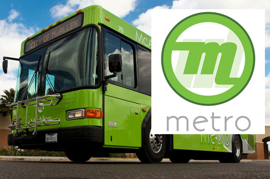
Public transportation in McAllen has struggled to acquire the popularity bigger cities like Austin have come to have. So with a brand new logo on deck and new bus vehicle designs, McAllen looked ready to launch a new campaign to help promote affordable and quality public transportation.
I was asked to help develop a new website design to communicate their brand online. This was my first public transportation website that I’ve designed so doing research was made a priority for me. I wanted to see how metro websites had been designed before, what has worked, what can be improved, and how I should properly approach the look for MetroMcAllen.com. From our first meeting, Dallas Area Rapid Transit (DART.org) was referenced as a successful website design they wanted to take inspiration from. At first glance, DART.org has a lot of information going at once. I knew they wanted similar features, but realized there would be a cleaner way to present it.
A few key elements needed for MetroMcAllen.com included:
• ability to Plan Your Trip, available on every page
• icons for users to easily recognize services they needed
• keeping things visually clean and making the experience easy
• strong visuals and photography in keeping with the McAllen Metro brand
• visually linking the website to the new green McAllen buses now circulating the city
• target audience included just about everybody, but they especially wanted to try to add the college demographic.
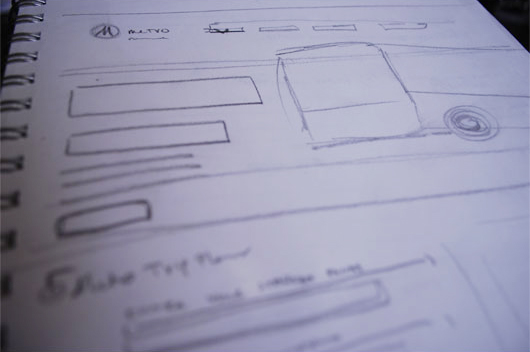
As with every design of mine, I started with sketches.
I knew I wanted to have their new bus design be front and center to really breathe life in to the website. I wanted to have a very usable navigation menu, bold messaging on the home page, and an organized hierarchy for the typography to help users easily find any information or services they were looking for. With the large amount of content that was provided to me in their site map, I knew maintaining a strong template for the internal pages would be needed as well.
After I had a direction, I dug in to Photoshop.
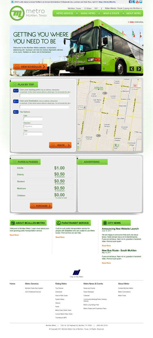
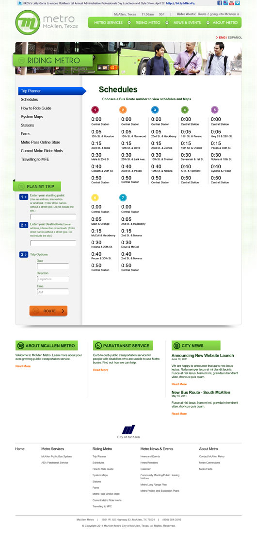
I really wanted to let the bus come right off the page. I cropped it in such a way that helped make that happen. I maintained the green and orange color scheme as on the bus themselves and added small elements that might be found on a subway map or street sign. The navigation menu is an example. Each link is “connected” by a “destination dot”. The header banners for “Plan Your Trip” and “Fares” have a look that wraps around the page. I liked this element because it mirrors what the motion of a street or route would look like.
The internal pages allowed for the top headers to switch out photography. This allowed to hit that college demographic they were asking for. Each main section would allow for new photography that could help target a new audience.
I met with the McAllen team to review and ask for some feedback. I was lucky enough to be working with a great team that were very helpful and made the design process go very smoothly. Thankfully, they were very pleased with my direction and only had minor additions and tweaks. I completed the revisions and handed over the final design to programming and development.
I was definitely happy with the final result. My favorite part about this project was being able to work with a team that were passionate about improving the city of McAllen in such a positive way. I think a public service like transportation is a vital component for unifying a city. During the design process, I got wind that the new buses were attracting much more deserved attention from the public, employee morale was up due to a new branding strategy to provide uniforms, and ridership was on the rise. I hope their new website design will only contribute to McAllen Metro’s growing popularity. Though the website design is currently still in programming at the moment, it is set to launch in the next month. Visit www.metromcallen.com soon.
Phil Chairez
phil@springbotdesign.com
www.springbotdesign.com
























Interesting, indeed! Good work, Phil 🙂 Now if we can only get Brownsville to follow in McAllen’s footsteps 😉